The Original Dahlia Template
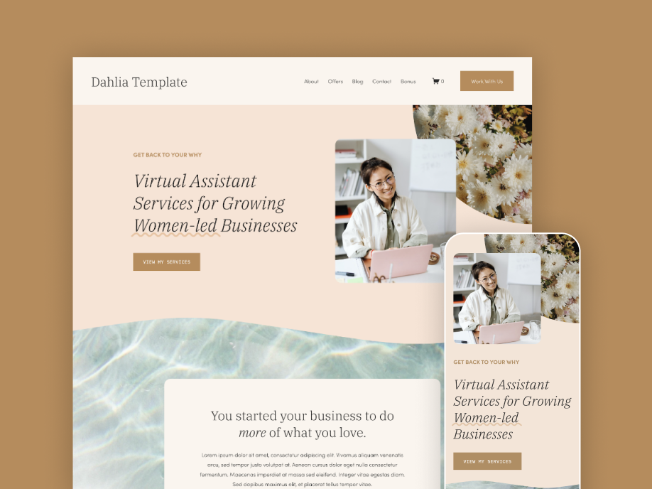
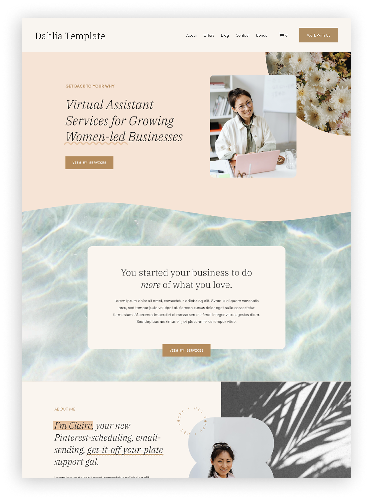
If you’re looking at the Dahlia template for your own Virtual Assistant website but want to see it styled a few different ways first, you’re in the right place! The original template is designed to be a colorful and little bit feminine, with an organic feel.
The Palette:
Light Tan: #faf5ef
Light Peach: #e8c4a5
Gold: #b58c5d
Dark Grey: #282828

So if you love the overall vibes of the Dahlia Template, but you'd like to make it feel a bit more you, below is some color inspiration to get you started. These three palettes keep the same fun, colorful vibes of the original template, but each put their own spin on it. Feel free to take these colors directly for your own website, or use them as a springboard to play around and find something new.
And if you’re wondering how hard it is to achieve any of these looks, it’s as simple as editing the fonts and colors in your template settings — that’s the only change from the original on all of these examples! Which I love, because it means you can make the template feel so different with just a few clicks.
Palette 1: Coastal Wave
cool • calm • monotone
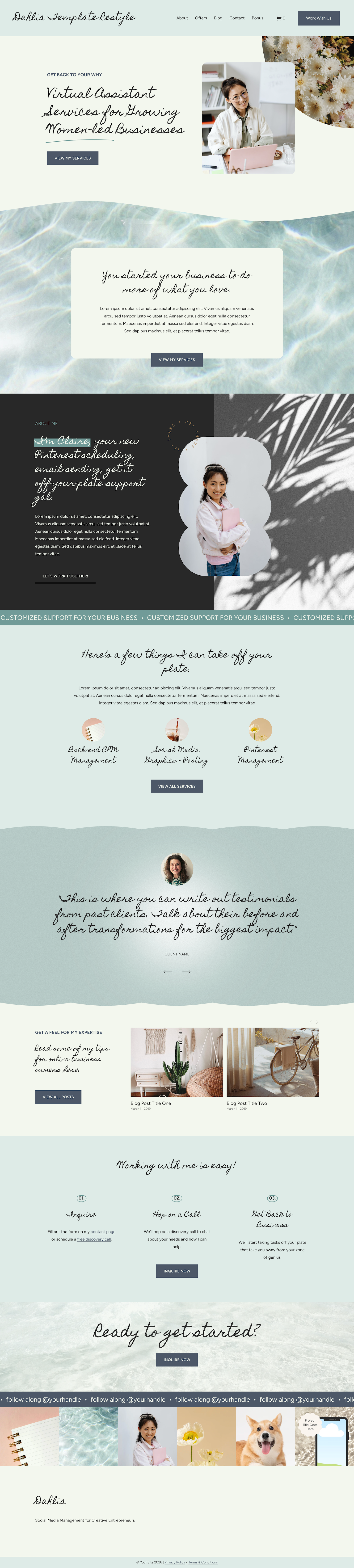
This palette uses all shades of blue, so to counteract that cold feeling I added a personal script in the header font. I think this styling goes to show that you can have a welcoming and even feminine website - without pink!
The Palette:
Light Sea Foam Green: #f3f7ee
Teal: #719b98
Navy: #4d5868
Dark Grey: #282828
Fonts used: Homemade Apple, Figtree



↓ Hover and Scroll ↓
Palette 2: Bold Bouquet
flirty • playful • vibrant
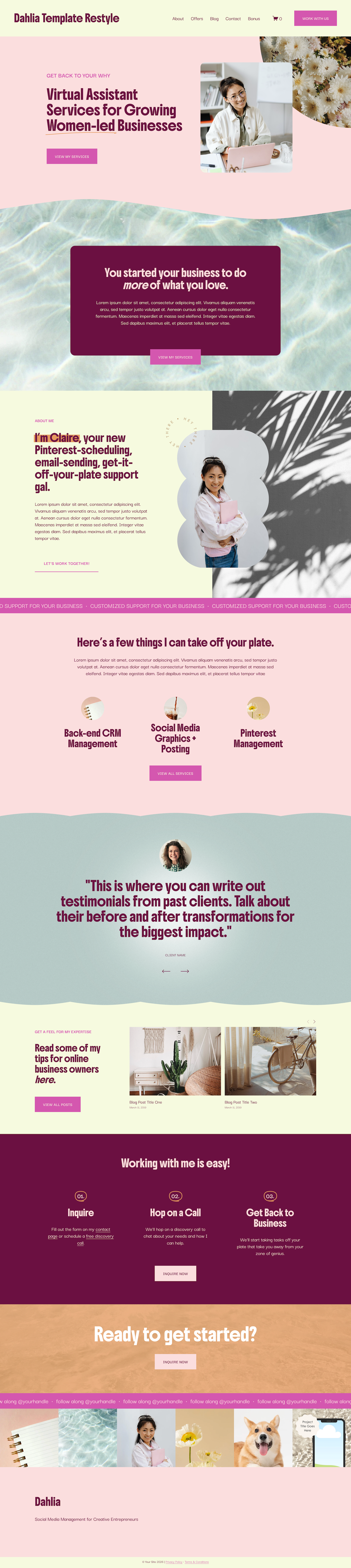
Neutrals are nice, but sometimes you just want something bold and memorable. This palette reminds me of a bright summer bouquet, and I love the pops of hot pink. Some of my favorite color palettes I’ve pinned on Pinterest have a color I’d never expect, so I wanted to include an example of one here. By choosing the yellow as a lighter unexpected color, it can become a background or text accent to show off the color without it taking over.
The Palette:
Light Yellow: #f6fae0
Orange: #e59a5d
Light Pink: #fbdedf
Hot Pink: #d457af
Dark Purple: #6b1041
Fonts used: Boldonse, Darker Grotesque
↓ Hover and Scroll ↓
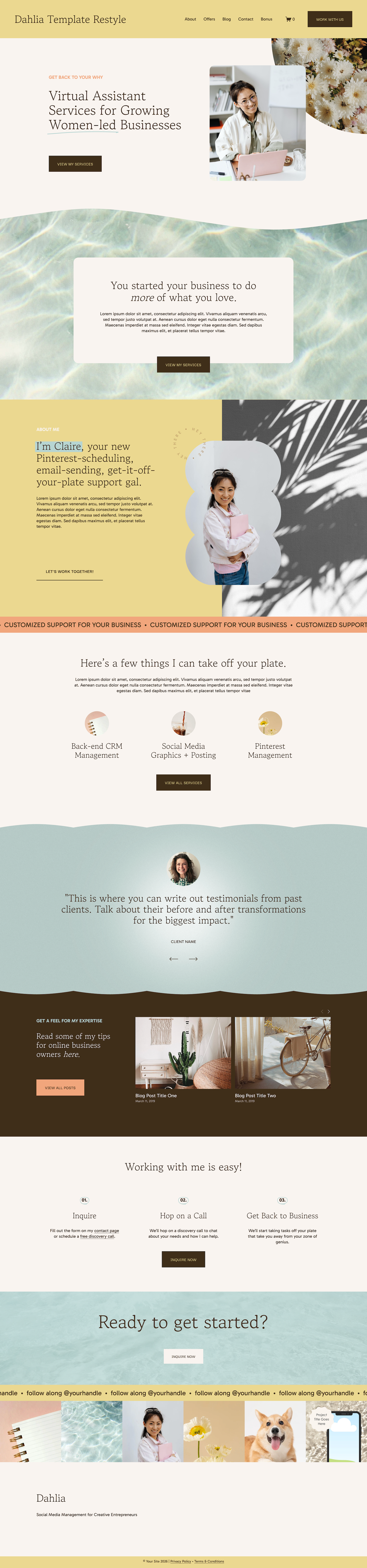
Palette 3: Beach Towel
earthy • Hopeful • grounded
For some reason this palette reminded me of a day at the beach. I think it’s a fun way to put unexpected colors together (like orange and green) and still have them work well! Since the three middle colors are lighter (therefore present less contrast) the brown is mostly what’s used for the buttons. Read more tips about color contrast and accessibility here!
The Palette:
Light Cream: #faf4f0
Light Green: #ead890
Blue: #b6d6d3
Orange: #f2a77c
Dark Brown: #402e1a
Fonts used: Gowun Batang Libre, Gabarito

↓ Hover and Scroll ↓