
What Is "Website Accessibility"?
Website Accessibility is the practice of designing your website so that anyone with visual, auditory, physical, speech, cognitive, and neurological impairments can easily understand, navigate, and interact with your site. There are a lot of different ways to make your website more accessible, but today we're focusing on color contrast.
What Is Color Contrast?
Color contrast is the difference in brightness between two colors. (Usually this is your text color and the background it sits on.) The higher the contrast, the easier it is for people to read.
Low contrast (think light gray text on a white background) might sometimes look sleek or fun, but it can actually be hard to read - especially for people with visual impairments like low vision or color blindness. It's also harder for everyone to read on a phone screen in bright sunlight or when you're tired and squinting at your laptop late at night.
The Web Content Accessibility Guidelines (WCAG) actually have official contrast ratio standards you can aim for, which is where a contrast checker tool comes in handy.
My Favorite (Free) Color Contrast Checker
There are lots of free tools on the internet you can use to check your color contrast rating, but my favorite is this one by Coolers. You can enter the hex codes of your text color and background color, and it will give you a contrast score.
I also love this specific tool because there's a "click to fix" button that will fix make your inaccessible color pairings!
Check out the color checker here →
Tips for Color Accessibility on Your Website
Now that we've talked about what color contrast is, here's a few quick tips you can apply to your website today to make sure it meets accessibility standards.
1. Make all body text black (or dark neutral)
When it comes to your body text (aka the paragraphs you actually want people to take the time to read), black on a white or light background gives you the highest, most reliable contrast.
You can see in the screenshot below, hot pink is okay when used as large text, but as small text it doesn't quite pass the accessibility check.
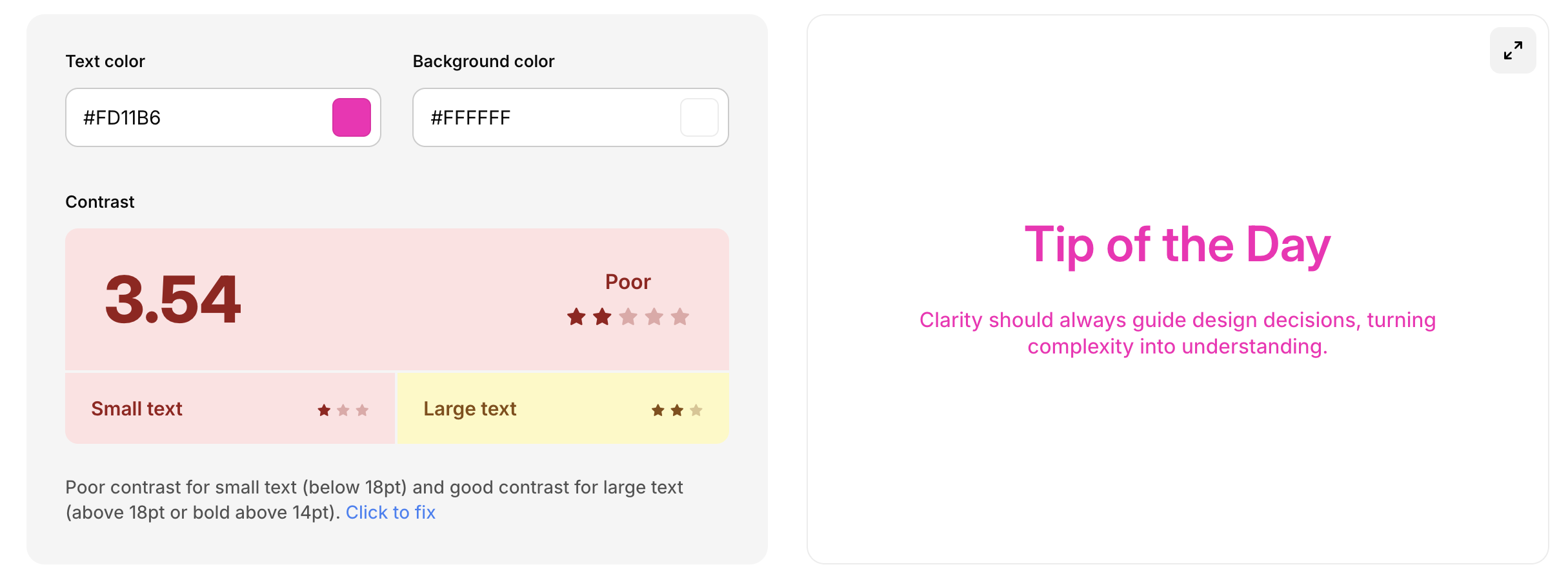
For body paragraphs and small text, the general rule is to stick to black, dark grey, or a very dark neutral for highest contrast and accessibility.
2. Save colorful text for headlines or short subheadings only
Like the previous point, headlines and subheadings are usually bigger and bolder, which means they can get away with lower contrast than smaller body text and still be readable. This is a great place to bring in your brand colors! Just be sure you run your combos through a contrast checker first to make sure they're not too low.
3. Make your buttons stand out
Your buttons are one of the most important thing on the page, because it's how you show people what to do next! Make sure there's enough contrast between:
your button color and the background it sits on
your button text and button background color
If your button blends into your site, people might not even realize that it's clickable.
4. Use color overlays when adding text over a background image
Background images look great, but they can be difficult to work with when it comes to contrast. (Especially if the image is super busy or has lots of different colors.) An easy fix is to add a color overlay (a solid color layer with some opacity) over your image. This darkens (or lightens) the image just enough to give your text a consistent, readable background and can help with accessibility.
Below is an example of text over a background with and without a dark color overlay, taken from my Ivy Squarespace template. Clearly, the background with the dark overlay is much easier to read!


Color Accessibility Makes Sure Your Website Works for Everyone
Color accessibility is a simple thing to fix, but it makes a huge difference in how usable (and professional!) your website looks and feels. A few small tweaks to your text, background, and button colors can go a long way in making sure everyone who lands on your site can actually see what's on it.
Next time you're tweaking your website (or maybe launching a new website with a template!) pull up a contrast checker and give your color palette a quick audit. Your future website visitors - and eventually clients - will thank you!
